
This was written by Jordan Sissel.
On the 8th day of the first sysadvent, I talked about ways to get graphs from arbitrary data, but I was never really satisfied with the result since I find gnuplot to be a bit cumbersome (though it is powerful).
Since then, technology and tools have improved greatly. For one, Google's got some pretty neat features in their Google Spreadsheets product. Bonus, it's free to use and if your company already uses Google Apps, you've got an easy way to share data and spreadsheets easily among coworkers.
So why care? Well, the spreadsheets product has some excellent statistical and visual tools.
The first time I was exposed to this tool was when I worked at a web advertising company: When debugging some odd user tracking data, the workflow usually included dumping the logs to csv, loading into Excel, doing some magic, and somehow the answer seemed to reveal itself. My first times watching this process reminded me of those 'enhance that photo!' scenes in some crime dramas, but this wasn't fiction. Sometimes the person driving Excel moved so quickly my face had this "are you a wizard?" expression on it.
Load the data, do some grouping, sort, filter, summarize, "enhance" ... Bam. Answer!
Let's figure out how to do that, but first we need a data set to play with.
Mail server activity
There are a bunch of mail servers at work. Let's look at yesterday's log file sizes and compare them in a spreadsheet (sounds exciting, I know!)
(
# ssh into a few servers and get the file sizes of certain logs
echo "host\tfile\tsize"
for i in server1 server2 server3 server4 ; do
ssh $i du -sb /var/log/{mail.log,auth.log,syslog}.1 \
| awk '{ OFS="\t"; print "'$i'", $2, $1}
done
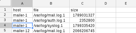
) > /tmp/maildata.tsvThe output is hostname, logfile, size-in-bytes; tab-delimited. In general, most spreadsheet tools can import data that is comma or tab-separated quite easily. My data looks like this:
host  file  size
mailer-1  /var/log/mail.log.1 1789031327
mailer-1  /var/log/auth.log.1 2352800
mailer-1  /var/log/syslog.1 1799335420
mailer-12 /var/log/mail.log.1 2066206745
...
Import CSV
Loading this into a spreadsheet is easy. In Google Spreadsheets, File -> Import will let you do it.
Once imported, I get a nice spreadsheet with three columns:
As you see, Each line in the imported file becomes a row.
Pivot Tables
Pivot tables let you group and aggregate data.
To make one, select all the data in your spreadsheet, then choose Data -> Pivot table report from the menu.
Let's try to answer some questions with a pivot table.
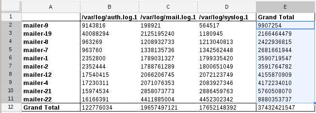
Which server has the largest total logs?
On the right of the spreadsheet, you'll see "Report Editor" where you can add rows, columns, and values to your pivot table.
To see which server has the largest total logs:
- click 'Rows - Add field' and choose the 'host'
- click 'Columns - Add field' and choose 'file'
- click 'Values - Add Field' and choose 'size'
At the end of each column and row will be a 'Grand Total' entry which summarizes the whole column or row.
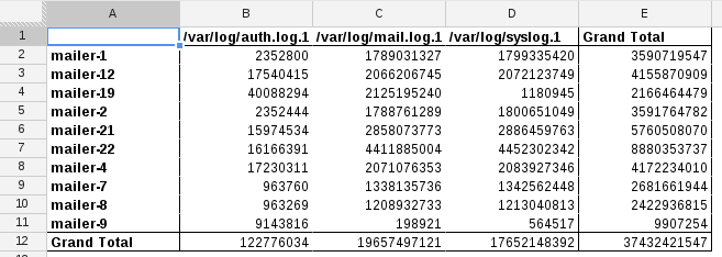
Since I'm looking for 'largest total logs', for the 'Group by: host' panel on the right, choose 'Sort by -> SUM of size in...' 'Grand Total' - which results in this nicely sorted display:
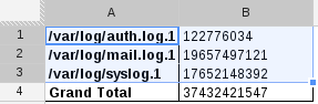
Which log is largest across all servers?
Create a new pivot table, but this time specify 'file' as the rows, don't add any columns, and specify 'size' for the values. The result is a table showing total sum by each log file:
Visualization
Often, problems aren't easy to solve if your only method is to eye-ball a table full of numbers. A big table of numbers is indistinguishable from noise, so you need a better way to represent the data.
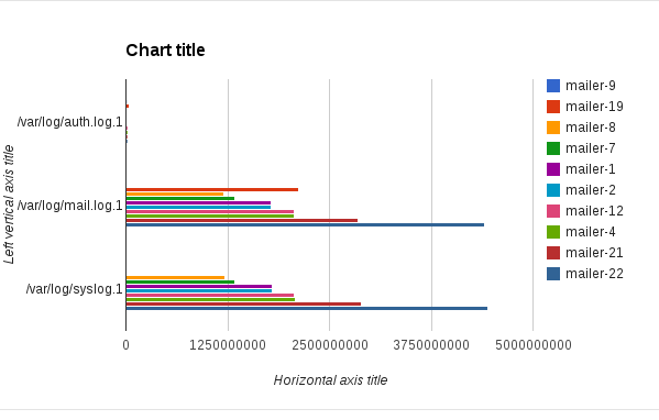
Graphs are nice, right? Simply select the data in the pivot table (or the spreadsheet) and choose Insert -> Chart from the menu. How about a bar chart with comparing log sizes across servers?
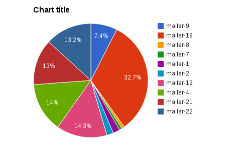
Or a pie chart?
There are two main points to make here. First, that this tool gives you a wide array of tools to mold your data into something that answers your questions. Second, that the minimum number of steps required are usually small.
Select some data, graph it. Select more data, choose rows/columns/values to view in aggregate, and maybe make a graph on that.
It's pretty awesome.
Leveling Up with Forms
Spreadsheets has this other neat feature called Forms (New -> Form from google docs). A form is basically just a customizable input form that inserts to a spreadsheet when submitted.
What if you created a form and had a computer write to it, kinda like logging to your spreadsheet? When creating the form, there is access control that requires login by default, but you can turn that off - uncheck 'Require
For fun, Here's a sample form I made. The interesting part here isn't that you can type stuff in as a human, but you can submit with curl if you wanted to!
How to submit to a Google Form with curl:
- Take the 'formkey' and put it on this url:
https://docs.google.com/spreadsheet/formResponse?formkey=FORMKEY curl -XPOST https://docs.google.com/spreadsheet/formResponse?formkey=FORMKEY -d "entry.0.single=first&entry.1.single=second&submit=Submit
The http POST payload is form url-encoded with 'entry.N.single' being each field value (in your browser, 'inspect element' on the form inputs to see the names). You must also include 'submit=Submit' set in the POST or google docs won't record the submission.
Here's a full example using the sample form I made (linked above):
echo -n "What is your name? "; read name
echo -n "How are you? "; read status
url="https://docs.google.com/spreadsheet/formResponse?formkey=dE9EOTROMzBIeG92UDZ2cG9XaHRucFE6MQ"
curl -s -XPOST "$url" -d "entry.0.single=${name}&entry.1.single=${status}&submit=Submit"
In the output of curl, you should see something like "Your response has been recorded".
You can view the results of form submissions to this specific form here: sysadvent sample form spreadsheet
The spreadsheet updates in near-real-time with form postings. Any charts you are using are also updated when the spreadsheet changes. Smells like this could be useful for light logging and metric recording, right? I think so!
Looking back at the 'mail logs size' data set above, we can use forms to automate this. Set up a daily cron job that publishes the size of each log file to a form and you can trend usage patterns over time. If you don't have a graphing system available right now, like Graphite or Ganglia, this Forms solution could be just the right tool for you.
Conclusion
Spreadsheets in general are really useful tools because they let you treat your data like Play-Doh - squish and shape your data into whatever form is most useful for you. Google Docs is an easy way to get these spreadsheet and forms features.
Further Reading
- Pivot Tables in Google Docs (intro video by Google)
- Pivot Tables in Google Docs (a real-world tutorial)
- Charts tutorial in Google Docs


1 comment :
Thanks for the Article. Would you please attach sample data that you have used in spreadsheet?
That would be very helpful to try things you suggested.
Post a Comment