Showing posts with label visualization. Show all posts

December 10, 2021

Day 10 - Assembling Your Year In Review

By: Paige Bernier (@alpacatron3000)
Edited by: Jennifer Davis (@sigje) and Scott Murphy (@ovsage)

Intro

There are a few moments in my career that I have been struck by a story told with data. When I set out as a Site Reliability Engineer into the big wide world I wanted to capture that data storytelling magic and have adapted a presentation I call the “Year in Review”.

My first company had a tradition of taking a moment to pause and review the year by the numbers. The showstopper was the chart showing the amount of data ingested year over year since the founding.

In a single glance that chart conveyed a story that would take hours to tell!

It communicated the incredible efforts the employees took to scale the system to handle ingesting, processing, publishing and storing an ever increasing mountain of data. It illustrated how far the company had come and we were confronted head on with the realization that “what got you here, won’t get you there”.

The biggest impact I have seen comes after the presentation. Discussions from Year in Reviews have sparked sweeping oncall management changes as well as minor, but important, changes in the way developers engage with the SRE team.

Before diving into implementation details, let’s look at why this type of data storytelling is such a powerful tool by examining the core purpose of SRE

The Mission of SRE

The mission of an SRE team is to improve system reliability by facilitating change.

System reliability is the sum of hundreds of decisions humans make when developing, deploying, and maintaining software systems; it is not an intrinsic property1 of the systems (Patrick O’Connor, 1998). SRE job descriptions tout phrases like “evangelize a DevOps culture” and “influence without authority” acknowledging our roles as change agents.

And as often heard, “change is hard”. As change agents, we are often faced with conflicting priorities, multiple stakeholders internal and external, and fear of the new and unknown.

However, just as often we hear “change is the only constant”. Whether it’s hardware improvements, operating system upgrades, security vulnerability announcements, software dependencies, or the software that we manage as a service, we are constantly monitoring and implementing change.

Combine these two axioms, for extra difficulty:

Ask any engineer who has been forced into a major operating system upgrade when the version of software they’re running requires the previous OS.

As an SRE I often want to make changes across the entire engineering organization such as developing oncall onboarding, ensuring that we are monitoring the customer’s experience, clarifying the lines of responsibility between developers and operators and more!

These types of changes that affect everyone is difficult to effectively implement until two things are true:

  • Is there a shared understanding of the current state?
  • Is there agreement that the current state needs to change?

This does not mean there needs to be consensus on what changes need to be made!

Is there a shared understanding of the current state?

The answer to this can be a resounding “Yes!” after your Year in Review presentation. Here’s why:

Humans learn best from stories, feelings, senses, and opinions commonly known as qualitative data. Focusing only on these exclusively you risk coming to broad conclusions without nuance or context.

Businesses claim to operate on data, facts and figures, or quantitative data. Focusing purely on the numbers you risk having too many details leading to irrelevant rabbit holes.

In fact, the two seemingly disparate viewpoints aren’t at odds at all. You can even validate findings by using the other category of data.

Feel: “Our monitoring sucks, none of the last 5 pages I got were actionable”

Fact: The primary oncall was paged 5 times out of business hours last week

Finding: Team X is getting paged frequently for non-actionable reasons

Hosting a “Year in Review” means weaving a story using the quantitative data about what occurred in your systems with the qualitative “anec-data” from a human perspective to build a foundation to introduce change.

Is there agreement that the current state needs to change?

This is a more complex endeavor - identifying and implementing change is the hard work of collaborating across teams, roles and competing incentives, motives, and needs. Think of “Year in Review” as a springboard for driving discussion and debate to align on “do we agree something needs to change?”

What does this look like in practice?

At a previous company I heard from engineers and managers alike that the oncall rotations were in need of a shake up. This was an excellent starting place where everyone agreed that there was a problem but was having trouble implementing the necessary changes.

With a goal in mind to identify what exactly the oncall issues were my team tailored a “Year in Review” focused mainly on oncall metrics such as alert noise, hours oncall per engineer, pages received per engineer. Slides illustrated the deluge of alert storms no human could possibly investigate in a given shift and were largely unactionable noise. The impact of not addressing this problem was clear, we were likely missing important signals in the noise and oncalls weren’t able to effectively prioritize their time.

After reviewing the data as a group, my team facilitated a brainstorm to address the barriers to changing the rotations:

  • How to handle ownership when multiple teams contribute code?
  • What are the “hot potato” services no one feels comfortable owning?
  • What services are unofficially owned by a single engineer that needs documentation?
  • What is the goal of a low urgency or warning alert?

Based on the main discussion and others in standups and sidebars, my team proposed new team-service ownership and rotations. Several weeks and few rounds of revisions later we merged the PR with our new Terraformed oncall rotations!

DIY “Year in Review”

So, how do you create a “Year in Review” for an SRE team? To start, I typically have a few things in mind about what I think happened and what the data will show. It is fascinating to see where your perception of the system and reality diverge. You can kick off your process by asking a couple of questions:

  • What story are you expecting the data to tell?
  • What changes do you think need to be made in the next year to improve reliability?
  1. Book a meeting with all parties (including engineers, managers, sre, qa, ops, product managers). If there is an existing meeting like an All-Hands or Demo Hour sign up for a presentation slot
  2. Kick off a brainstorming session and have participants list out possible changes to include. Such as new features launched or infrastructure expansions to new regions, or even doubling the organization size.
  3. Ask teams (including managers)
    1. What data they would find interesting
    2. What data they could contribute from their domain
  4. List the company-specific tooling for data sources like:
    1. Version Control
    2. CI/CD
    3. Monitoring
    4. Incident Management
    5. Ticket tracking system
    6. Documentation store
    7. Support ticket system
  5. Enlist the help of others to gather the interesting metrics over the past year or year over year. Some suggestions are:
    1. Noisiest alerts
    2. Number of environments
    3. Oncall engineers
    4. Number of services
    5. Ratio of oncall engineer to number of services oncall for
    6. Age of dependencies/libraries
    7. # of hours oncall per person
    8. Number of features launched
    9. # of after hour pages
    10. Ratio of warning alerts to pages
    11. Number of production deploys rolled up by day
    12. Number of open incident AIs
    13. Ingress traffic or other indicator of system load
    14. Most viewed documentation pages
    15. Most search documentation terms
    16. Time to first PR
    17. ….and so much more!
  6. Slice and dice the data trying out top 10 lists, total sum, or segment by using whatever constructs your company has such as:
    1. Department
    2. Service
    3. Team
    4. Product Feature
  7. Group the data into themed areas “oncall” “production” “onboarding” etc. If you have convinced folks to co-present with you each person can be responsible for presenting a different theme
  8. Assemble into a slide deck with one chart per slide to maximize impact
  9. Hold the meeting and present your findings,
  10. Discuss! In the meeting, after the meeting before the next Year In Review how you interpreted the data compared to others
  11. Publish the data and your queries so everyone can explore and answer their own questions

Parting Thoughts

SREs are uniquely suited to facilitate a Year in Review bringing a system-wide perspective on the people, processes, and technology and mission to improve reliability. Keep in mind that much like effecting change, hosting a Year in Review is not a solo effort!

Going solo means you will only capture YOUR thoughts which will almost certainly be tempered by the unique vantage points from others. The more perspectives you invite, the fuller the story of your system will be.

Please share your favorite data storytelling moments or Year in Review stats with me on Twitter at @alpacatron3000

Citation

O’Connor, P. (1998) Standards in reliability and safety engineering [Article]. Elsevier Science Limited, 9 Dec. 2021.

https://www.sciencedirect.com/science/article/abs/pii/S095183209883010X

Notes


  1. Since the SRE field is still getting established outside of Google, I started to read perspectives from Reliability Engineering in other disciplines. A nugget from Patrick O’Connor’s “Standards in reliability and safety engineering” paper sparked a spicy but important revelation about reliability.

    “Those reliability standards which apply mathematical/ quantitative methods are also based on the inappropriate application of “scientific” thinking. An engineered system or a component has no intrinsic property of reliability, expressible for example as a failure rate. Truly scientifically based properties of systems and components include mass, power output, etc., and these can therefore be predicted and measured with credibility. However, whether a missile or a microcircuit fails depends upon the quality of the design, production, m~nten~ce and use applied to it. These are human contributions, not “scientific”. “ 

December 9, 2014

Day 9 - D3 for SysAdmins

Written by: Anthony Elizondo (@complex)
Edited by: Shaun Mouton (@sdmouton)

In this post we will talk an introductory look at D3.js and using it on relatively "raw" datasets such as those in CSV or JSON.

D3.js is a powerful Javascript library that allows you to build SVG images and animations, implemented with HTML5 and CSS.

There are some who will tell you D3.js has a steep learning curve. I think the reason for this is it lives at the center of a Venn diagram where the circles are Javascript, CSS, math, and graphic design. Not the most common skill set.

But don’t let that scare you. You’re awesome! You can do it!

Visualizing your Data


Are you collecting metrics? A recent survey by James Turnbull of Kickstarter says that 90% of you are. (If not, why not?) Ideally these metrics are fed into a permanent installation of a tool that can be used for measuring performance, alarming on errors, or just general trending. And that is great.

But perhaps you just want to whip up something on an ad-hoc basis. D3.js is superb at this. With simply a CSV file and a web server (even something as simple as "python -m SimpleHTTPServer 8000", see William Bowers' list) you can create something that works on any modern browser, mobile included.

Data Type and Format


Before we can do anything, we have to think about what type of data we have. More precisely, what is the story we want to tell about it? We might have a collection of ohai output (JSON) from 10,000 servers. This type of data would be nicely visualized with a force-directed graph, perhaps even sorted by type. Maybe you have logs of concurrent sessions on HA Proxy or your F5 load balancer. Then this heat map would work well. Your data might be as simple as a single metric, but you want to chart it over time. A simple line chart would be sufficient.

Fundamentals of D3.js


D3.js operates on the DOM of a web page. You can boil most of its operation in three phases. First, it creates SVGs and adds ("appends") them to the page. Next it reads in data embedded in the page itself, from a separate file, or from other online source via AJAX. Then, it performs transforms to the SVG elements based on this data, or perhaps based on user input.

Simple Example


Now we’ll try create a simple example. Assume our data, after some awk mangling, is in a TSV. The first column is the date in YYYY-MM-DD format, the second is a scalar indicating how many servers we have.
date   servers
2013-12-08  4343
2013-12-07  4328
2013-12-06  4325
First, include D3 in our HTML file,
<script src="http://d3js.org/d3.vs.js"></script>
Now create the SVG.
var svg = d3.select("body").append("svg")
.attr("width", 860)
.attr("height", 500)
.append("g")
.attr("transform", "translate(" + margin.left + "," + margin.top + ")");
Time to load our data.
d3.tsv("vmcount.tsv", function(error, data) {
data.forEach(function(d) {
d.date = parseDate(d.date);
d.servers = +d.servers;
});
And draw it.
svg.append("path")
.datum(data)
.attr("class", "line")
.attr("d", line);

The .append("g") and attr("d", line) are not magic. They are SVG element tags. The "g" attribute indicates "group everything together as one". The "d" attribute defines a path to follow. The 3 bits of Javascript above are the core of the work, but they alone are insufficient. There is a bit more required to bring it to life and make it look nice. That includes defining axes, scales, labels and domains (in the geometric sense). The full working example can be found here. It adds all the features mentioned above, plus a fancy hover to show precise values.

On Your Way


Hopefully I’ve demystified D3.js for you a bit with this short introduction. To dive deeper I suggest browsing some of Mike Bostock’s simpler examples, and don’t be afraid to ask your friendly neighborhood frontend developer for help! :) The full D3.js API can be found here.

Resources:

December 1, 2012

Day 1 - Easy Visualizations with Spreadsheets

This was written by Jordan Sissel.

On the 8th day of the first sysadvent, I talked about ways to get graphs from arbitrary data, but I was never really satisfied with the result since I find gnuplot to be a bit cumbersome (though it is powerful).

Since then, technology and tools have improved greatly. For one, Google's got some pretty neat features in their Google Spreadsheets product. Bonus, it's free to use and if your company already uses Google Apps, you've got an easy way to share data and spreadsheets easily among coworkers.

So why care? Well, the spreadsheets product has some excellent statistical and visual tools.

The first time I was exposed to this tool was when I worked at a web advertising company: When debugging some odd user tracking data, the workflow usually included dumping the logs to csv, loading into Excel, doing some magic, and somehow the answer seemed to reveal itself. My first times watching this process reminded me of those 'enhance that photo!' scenes in some crime dramas, but this wasn't fiction. Sometimes the person driving Excel moved so quickly my face had this "are you a wizard?" expression on it.

Load the data, do some grouping, sort, filter, summarize, "enhance" ... Bam. Answer!

Let's figure out how to do that, but first we need a data set to play with.

Mail server activity

There are a bunch of mail servers at work. Let's look at yesterday's log file sizes and compare them in a spreadsheet (sounds exciting, I know!)

(
  # ssh into a few servers and get the file sizes of certain logs
  echo "host\tfile\tsize"
  for i in server1 server2 server3 server4 ; do 
    ssh $i du -sb /var/log/{mail.log,auth.log,syslog}.1 \
    | awk '{ OFS="\t"; print "'$i'", $2, $1}
  done
) > /tmp/maildata.tsv

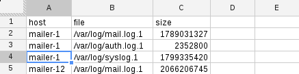
The output is hostname, logfile, size-in-bytes; tab-delimited. In general, most spreadsheet tools can import data that is comma or tab-separated quite easily. My data looks like this:

host  file  size
mailer-1  /var/log/mail.log.1 1789031327
mailer-1  /var/log/auth.log.1 2352800
mailer-1  /var/log/syslog.1 1799335420
mailer-12 /var/log/mail.log.1 2066206745
...

Import CSV

Loading this into a spreadsheet is easy. In Google Spreadsheets, File -> Import will let you do it.

Once imported, I get a nice spreadsheet with three columns:

As you see, Each line in the imported file becomes a row.

Pivot Tables

Pivot tables let you group and aggregate data.

To make one, select all the data in your spreadsheet, then choose Data -> Pivot table report from the menu.

Let's try to answer some questions with a pivot table.

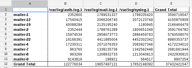
Which server has the largest total logs?

On the right of the spreadsheet, you'll see "Report Editor" where you can add rows, columns, and values to your pivot table.

To see which server has the largest total logs:

  • click 'Rows - Add field' and choose the 'host'
  • click 'Columns - Add field' and choose 'file'
  • click 'Values - Add Field' and choose 'size'

At the end of each column and row will be a 'Grand Total' entry which summarizes the whole column or row.

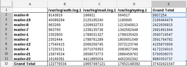
Since I'm looking for 'largest total logs', for the 'Group by: host' panel on the right, choose 'Sort by -> SUM of size in...' 'Grand Total' - which results in this nicely sorted display:

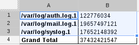
Which log is largest across all servers?

Create a new pivot table, but this time specify 'file' as the rows, don't add any columns, and specify 'size' for the values. The result is a table showing total sum by each log file:

Visualization

Often, problems aren't easy to solve if your only method is to eye-ball a table full of numbers. A big table of numbers is indistinguishable from noise, so you need a better way to represent the data.

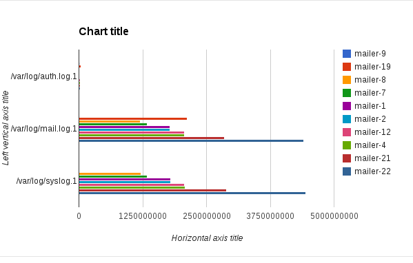
Graphs are nice, right? Simply select the data in the pivot table (or the spreadsheet) and choose Insert -> Chart from the menu. How about a bar chart with comparing log sizes across servers?

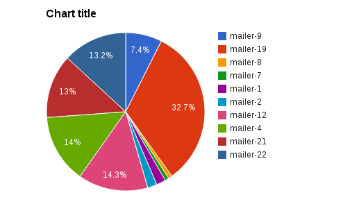
Or a pie chart?

There are two main points to make here. First, that this tool gives you a wide array of tools to mold your data into something that answers your questions. Second, that the minimum number of steps required are usually small.

Select some data, graph it. Select more data, choose rows/columns/values to view in aggregate, and maybe make a graph on that.

It's pretty awesome.

Leveling Up with Forms

Spreadsheets has this other neat feature called Forms (New -> Form from google docs). A form is basically just a customizable input form that inserts to a spreadsheet when submitted.

What if you created a form and had a computer write to it, kinda like logging to your spreadsheet? When creating the form, there is access control that requires login by default, but you can turn that off - uncheck 'Require sign-in to view this form'.

For fun, Here's a sample form I made. The interesting part here isn't that you can type stuff in as a human, but you can submit with curl if you wanted to!

How to submit to a Google Form with curl:

  • Take the 'formkey' and put it on this url: https://docs.google.com/spreadsheet/formResponse?formkey=FORMKEY
  • curl -XPOST https://docs.google.com/spreadsheet/formResponse?formkey=FORMKEY -d "entry.0.single=first&entry.1.single=second&submit=Submit

The http POST payload is form url-encoded with 'entry.N.single' being each field value (in your browser, 'inspect element' on the form inputs to see the names). You must also include 'submit=Submit' set in the POST or google docs won't record the submission.

Here's a full example using the sample form I made (linked above):

echo -n "What is your name? "; read name
echo -n "How are you? "; read status
url="https://docs.google.com/spreadsheet/formResponse?formkey=dE9EOTROMzBIeG92UDZ2cG9XaHRucFE6MQ"
curl -s -XPOST "$url" -d "entry.0.single=${name}&entry.1.single=${status}&submit=Submit"

In the output of curl, you should see something like "Your response has been recorded".

You can view the results of form submissions to this specific form here: sysadvent sample form spreadsheet

The spreadsheet updates in near-real-time with form postings. Any charts you are using are also updated when the spreadsheet changes. Smells like this could be useful for light logging and metric recording, right? I think so!

Looking back at the 'mail logs size' data set above, we can use forms to automate this. Set up a daily cron job that publishes the size of each log file to a form and you can trend usage patterns over time. If you don't have a graphing system available right now, like Graphite or Ganglia, this Forms solution could be just the right tool for you.

Conclusion

Spreadsheets in general are really useful tools because they let you treat your data like Play-Doh - squish and shape your data into whatever form is most useful for you. Google Docs is an easy way to get these spreadsheet and forms features.

Further Reading

December 8, 2008

Day 8 - One-off graphs

You've got your nagios and cacti configurations all diligently tracking information for you. The data it monitors is available for viewing in graphs at your will, but what about the data it doesn't monitor?

You get a report that your apache servers are randomly serving errors and that the problem started last week. You don't have cacti watching this data, so you check the logs. The few-hundred-megs of logs are probably too much for you to eyeball, and seeing this data, now, in a graph, would help you out.

This report means two things: 1) Verify the report and fix the problem, and 2) add apache error servings to your monitoring system. What are your options for #1 and getting that data graphed now? Common sysadmin graph staples might include things like rrdtool, gnuplot, cacti, and others. Some of these tools are designed for recording and graphing data slowly over time and others require configuration changes or other complexities. It's possible you may be able to import historical data into your monitoring or trending system (cacti, etc), but if you don't know how, you have to graph it by yourself.

The path of least resistance is probably the best path when it comes to doing one-offs for visualizing or grabbing data. This means using the tool that requires the least amount of steps to go from data to graph with easy ability to iterate in case your graph output isn't helpful due to display decisions like scaling, etc.

Tools that help you do this include gnuplot, R, rrdtool, and Excel (or other spreadsheets that graph). These tools might help you manipulate the data before you graph it, but I'm going to assume that you've already got the data in some reasonable format (space, tab, comma delimited X and Y values).

We have apache access logs and want to see 500 error code trends. One approach might be to graph the ratio of 200s to 500s codes (200 is OK, 500 is internal error), or just graphing the 500s alone.

Making a useful graph depends much on how you aggregate your data. Do you aggregate on the hour, minute, 10 minute, second? You can go with your gut feeling, or you can take another approach. When gathering data, keep the data in the highest-precision format you have. In this case, we have data on the second precision.

# The '500' here matches the response code from apache logs
% egrep '" 500 [0-9]+ "' /b/access | sed -e 's/^.*\[//; s/\].*$//' | tee err500
01/Dec/2008:21:23:54 -0500
01/Dec/2008:21:24:08 -0500
01/Dec/2008:21:27:09 -0500
02/Dec/2008:05:23:34 -0500
08/Dec/2008:00:44:59 -0500
08/Dec/2008:00:45:55 -0500
< remainder of output cut >

# We count the instances per second by piping this output to 'uniq -c'
% uniq -c err500 > counts
If your graphing tool helps you make aggregation decisions such as "total 500s in an hour", then that's a help. Otherwise, you'll need to aggregate yourself before feeding your graph tool. RRDtool lets you do this by using the 'average' RRA and multiplying the value by the time interval. From what I can tell, gnuplot doesn't let you modify input data before graphing in a way that would let you aggregate values. R lets you do this easily as it's a statistics scripting language.

Data input for time series might require additional steps to convert the date into a value your graphing tool understands. Gnuplot accepts string time values and lets you specify the strptime(3) format string. RRDtool updates require times be specified in terms of unix epoch. R, from what I can tell, needs to be given numbers (like rrdtool). Excel hopefully has time parsing options, but I haven't tried.

Further, if your data doesn't have a point at every single unit of your graph, you will end up with odd-looking results when using lines to graph. This sways in favor of rrdtool since gnuplot and other tools that graph don't often accept this lack of data as OK. RRDtool has support for data points being 'unknown' and such and is much more drawn to time-series plotting.

Output is important too. Your graph is less helpful if the axes aren't readable; this means you need readable dates on your time axis. Both gnuplot and rrdtool allow you configure the X (time) axis labels and steps. It's difficult to do in R, from what I've tried and read.

For all the reasons above that help us see time-series data visualized most effortlessly, I would normally pick rrdtool. However, past experience has had me spend more time fighting rrdtool (read: pebcak) when I'm in a hurry, so I'll try gnuplot today. I fully confess in failing tonight trying to rush and re-learn rrdtool ;)

In gnuplot, you specify time as an input, from most any format, with:

set xdata time
set timefmt "%d/%b/%Y:%H:%M:%S"
If you want output to a file, use:
set terminal png size 580,300
set output "/tmp/apache.png"
The timefmt uses format strings specified by strptime(3). To graph the last year's worth of data in gnuplot (including the above xdata and timefmt lines):
set xtics rotate right
set xrange ["01/Jan/2008:00:00:00":"01/Dec/2008:00:00:00"]
set yrange [0:]
set format x "%Y/%b/%d"
plot "counts" using 2:1
Since 'uniq -c' (used above) outputs in the format 'count value' and our 'value' here is a timestamp for use with the x axis, we have to tell gnuplot to use the 2nd column for X and the count for Y.

This generates an ugly and not totally useful graph, because visualizing errors on that rate .

Changing from a seconds to another unit just requires some simple summation. Rounding the timestamp to whatever value (10 minutes, for example) and then doing another summation (uniq -c) on the output should be easy; any tool that supports strptime will help you, such as this small ruby script

If we sum errors by hour, the new graph gets a bit more useful, showing some days having very high error spikes compared to the average. As a note, since the output of strptime.rb is in unix epoch, I had to change the timefmt to "%s" and the xrange to '["1199145600":"1228089600"]'

Note: If you use gnuplot with it's default output device (don't run 'set terminal png') you get a useful GUI that you can zoom in and out of, which is pretty useful.

This is another case of having the right tools to do the job. I've used statistics tools like SAS before, and while writing this article today it feels like using such a tool to do simple, fast visualizations and analyses would be easier. It's possible R, Octave, or other math/stats tools provides this. On the other hand, I've never once heard of a sysadmin colleague using statistical tools, is this indicative of a problem?

Further reading:

Visualization periodic table
Neat periodic table showing lots of different visualization methods with examples
gnuplot
rrdtool
R's homepage