
Written By: TR Jordan (@_tr)
Edited By: Adam Compton (@comptona)
In the world of SaaS applications, good monitoring can be the difference between a successful product and a failure. There's a lot of ink spilled on what to do with your monitoring data, but somewhat less on what that data actually is. Etsy's Measure Everything is a great place to start. Capture points of interest everywhere in your application, and aggregate them up as counters, gauges, and the like. You don't have to stop with series of single numbers, though. Let's talk about gathering structured performance data via X-Trace, starting with a definition:
X-Trace is a network diagnostic tool designed to provide users and network operators with better visibility into increasingly complex Internet applications. It does this by annotating network requests with metadata that can be used to reconstruct requests, even those that make use of multiple network layers. X-Trace "enabled" Internet sites make use of these identifiers to record the path that requests take through their network.
The key bit about X-Trace is right there at the end. X-Trace isn't just a tool to collect metrics; it actually records the path that requests take through your system. This means that the end result isn't just a graph over time of some quantity. It's actually a full view of what happened to that particular request.
The other core feature of X-Trace is something that's left out of the definition. Because X-Trace annotates network calls, it's fundamentally distributed. As it traces requests, those requests aren't limited to a single machine, like a code profiler would be. Each piece of metadata is generated on a separate machine (typically by processes called agents), but a typical implementation also employs a collector which stitches all that information back together into a distributed trace.
The result is that X-Trace data is a much richer data source than something like graphs of machine load, host memory, or the number of signups. It's a full description of how your system responded to a particular request.
Building a Simple Trace
Let's get specific. The underlying data structure X-Trace uses to represent this complex data is a simple Directed Acyclic Graph (DAG). The nodes in the graph are entry and exit events for each layer. Layers are just names for something we want to measure: TCP connection lifetimes, RPCs, or application touchpoints. For a typical web application, it's easy to talk about layers as software packages which use the library in some way, so we'll do that. The first place a request touches a web app is the webserver, so a dirt-simple trace may only have 2 nodes in the graph: Apache Entry and Apache Exit. The edges in this graph point "backwards" -- exit events know about their preceeding entry events. This can be confusing, so let's actually flip them around so the arrows point in causal order. Our simple trace could be drawn (using GraphViz) like this:

Apache serving a static file. It's frequently easier to flip the edges in visualization, even though the underlying data is reversed.
So the forward arrow makes sense--then why did you say the edges point backwards? From an implementation standpoint, they have to! Each node is represented by a metadata string, which is just a bytestring. The high-order bits of this bytestring form the trace ID, a unique identifier which all nodes in this request's trace graph share. The lower-order bits are unique to each node, and typically also randomly generated. These are known as the event ID. Each edge is specified with this event ID. For the trace above, the two events would look like this:
Entry:
  Trace ID: BA84
  Event ID: FEED
  Edges: []
Exit
  Trace ID: BA84
  Event ID: DEEF
  Edges: [FEED]
With only that information, we have everything we need to draw that picture above. As long as we find some way to pass that edge ID between the beginning and the end of the request (and since they're on the same machine, local memory works fine), the events are easy to generate, and the collector can re-create the graph with no problems.
Getting More Complicated
If we were just interested in collecting simple timings, drawing a graph seems like overkill (because it is). The interesting thing about X-Trace is that it scales up to many events in a system, and we can still track them all in one place. Let's add a simple Ruby/Rails server behind Apache. We'll actually put the instrumentation points in basically the same place: at the very beginning of the Ruby request, and right at the end, after it returns the response body.

There's also an "info" event in this one, which can be used to add a bit more color to an entry/exit pair. More on that below!
There's one trick we have to play here to make this work. In Apache, it was easy to pass the event ID around, because it's all the same process. Between Apache and Ruby, they're different processes on different machines. Local memory won't work, so we have to get more creative. Fortunately, X-Trace is flexible; it doesn't matter how the metadata gets between events. In this case, an extra HTTP header (how about "X-Trace"?) on both the request and response works just fine. In general, any extensible protocol with optional parameters works well here: Thrift, Protocol Buffers, or even custom JSON over TCP, if you're rolling your own. If you can find room for a few additional bytes, your protocol can support X-Trace.
Adding these links gives us more than just the two timing measurements in one place; it allows us to start seeing mismatches between components. A frequent problem with multi-tier setups is queueing, particularly between the web server and the application servers. Monitoring just Apache or just Rails doesn't catch it, because the problem is the Apache is sitting around waiting for Rails to listen. There's no wasted work, but there is wasted time. With normal metrics, you have to go looking for it, but with X-Trace, it just shows up as a large time difference between two adjacent nodes.
Real Life Data
From here, we can scale this up to as many protocols and calls as we want. For protocols that don't easily support optional parameters in both directions (SQL, for instance), we can actually measure from the client side. This does have the disadvantage of convolving network latency and on-machine time at the database server, but in most cases, this isn't a big deal.
In these complex cases, this graph structure really starts to shine. A slow request might generate a trace with a slow SQL call. From a single-metrics viewpoint, speeding up this request means making this SQL call faster. With the entire trace, though, the problem might actually manifest as a cache miss immediately before the SQL call, or a strange-looking URL from the webserver because the client was asking for more data than a normal request. This context is crucial to debugging certain classes of problems, and it's simply not available in metrics-based monitoring solutions.
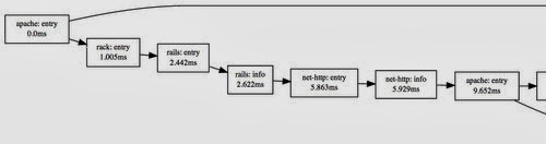
A moderately complex trace ... and it keeps going! This trace has 55 events in total.
Traversing a Trace
Once traces get big, the trick is to extract useful information out of them. There are a lot of tricks one can use on graphs, but there's actually more structure here we can exploit. Since X-Trace typically starts with entry/exit pairs of events, it's a good idea to build more structure around those pairs. For our simple Apache trace, it's easiest to think about that as a single Apache extent. That means just wrapping up the entry and exit in a single span of time. The (awesomely boring visualization) might look like this:
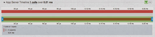
Just Apache.
The width is the full timeline of the request: 200us. Now that we have some grounding, we can start to build out more complicated traces below this. Adding rails is just adding a child extent to this top-level extent, and we can represent that with a bar below, on the same timeline:
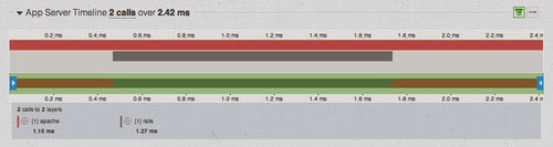
Deepening the tree.
This looks pretty similar to the events graph, but instead of looking at moments in time, this visualization focuses on layers: the components of the system. It's not as detailed as a profiler at each layer--we're not capturing every function call--but the whole trace is effectively a profiler, ordered by calls, for a distributed system, including access to call structure, self times, and cumulative times.
If you've got a complex architecture, with services calling services, this might look like a bit hairy, but fortunately, many apps scale by adding specialized services, not 50-level-deep calling trees. So you can see a fair bit in one place and, due to the time scale, quickly identify the service that dominated the load time. For instance, that moderately complex trace above reduces down nicely:

In this one, the problem isn't a single layer. Every layer adds a bit of time, meaning that we'll either have to be happy with our 70ms page load time, or look at eliminating an entire service or three.
Using Trace Data
Once we have this structure, sometimes the easiest thing to do with it is go backwards. Because each trace captures a number of different metrics on different layers, we can actually traverse this graph and pull them out into normal-looking graphs. This high-level view is easy to consume, but graphs backed by traces instead of metrics open up another level of drilldown. Spike in memcache latency? It could be because of increased traffic, but looking at a few traces might reveal that it's actually because there are a few URLs that request 10,000 different keys at once (as has been seen before). Inspecting the structure of a request can often times reveal just as much as looking at the timings of the components.
There's a lot more that can be done with this data, but suffice it to say, analytics are only as powerful as their data source. A few people have written implementations of it:
- AppNeta TraceView - Instrumentation in PHP, Python, Ruby, Java, and .NET. I actually used the free version for most of the visualizations in this post.
- Google Dapper - Google's own implementation, on their RPC infrastructure.
- Twitter Zipkin - X-Trace instrumentation, with trace visualizations.
Good monitoring is not only about the quantity of data collected, but also the quality.





 Posts
Posts

